Thai Honda · 2023 · Mobile · Cabinet firmware · Web · Back office · UX/UI Designer · Product Owner — GridWhiz
Honda Swap Station
Honda's battery-swap experience across four screens — app, cabinet firmware, website, and back office — re-sequenced so the phone finishes before the heavy lifting starts.

“ในเวลาที่เร่งรีบ คนจะเปลี่ยนแบตเตอรี่ยังไง ถ้ามือเขาไม่ว่างที่จะใช้แอปพลิเคชัน?
Mid-swap, both hands are full — so who's holding the phone?
ch.01 · the problem
The battery is heavy
Watching swaps in the field made the problem obvious: the old flow still wanted taps after the cabinet opened, while the rider's hands were already full — phone in one, a heavy pack in the other. The redesign moves every decision — confirm, pay, slot assignment — in front of the moment the battery comes out. The instant the door opens, the app says you can pocket your phone. Once you lift, it has stopped asking.
fixed before I started
ch.02 · approach
Decisions, and why
d.01
Re-sequenced to finish before the door opens
hands are full the moment the battery comes out
d.02
Says outright: "you can pocket your phone"
removes hesitation at the exact handoff point
d.03
Hands off to a large cabinet display
readable at arm's length, in direct sun
d.04
One state machine drives both screens
app and cabinet can never disagree on status
d.05
Unhappy paths resolve on-screen
a stuck swap shouldn't need a support call
d.06
Extended to web + back office
one platform, one design language, not three
ch.03 · scope
What I designed, what was already fixed
Designed
- Rider app UX/UI — the whole swap flow
- Cabinet touchscreen firmware UI
- Information architecture and flow on every screen
- Prototype and UI direction for the operator back office
Given
- Cabinet mechanism and slot hardware
- A ~30-second swap window
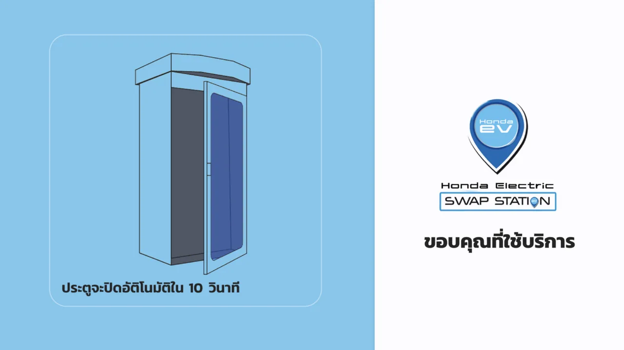
- A 10-second door-close timer
- Battery and safety standards
ch.04 · approach
App and cabinet, one state machine
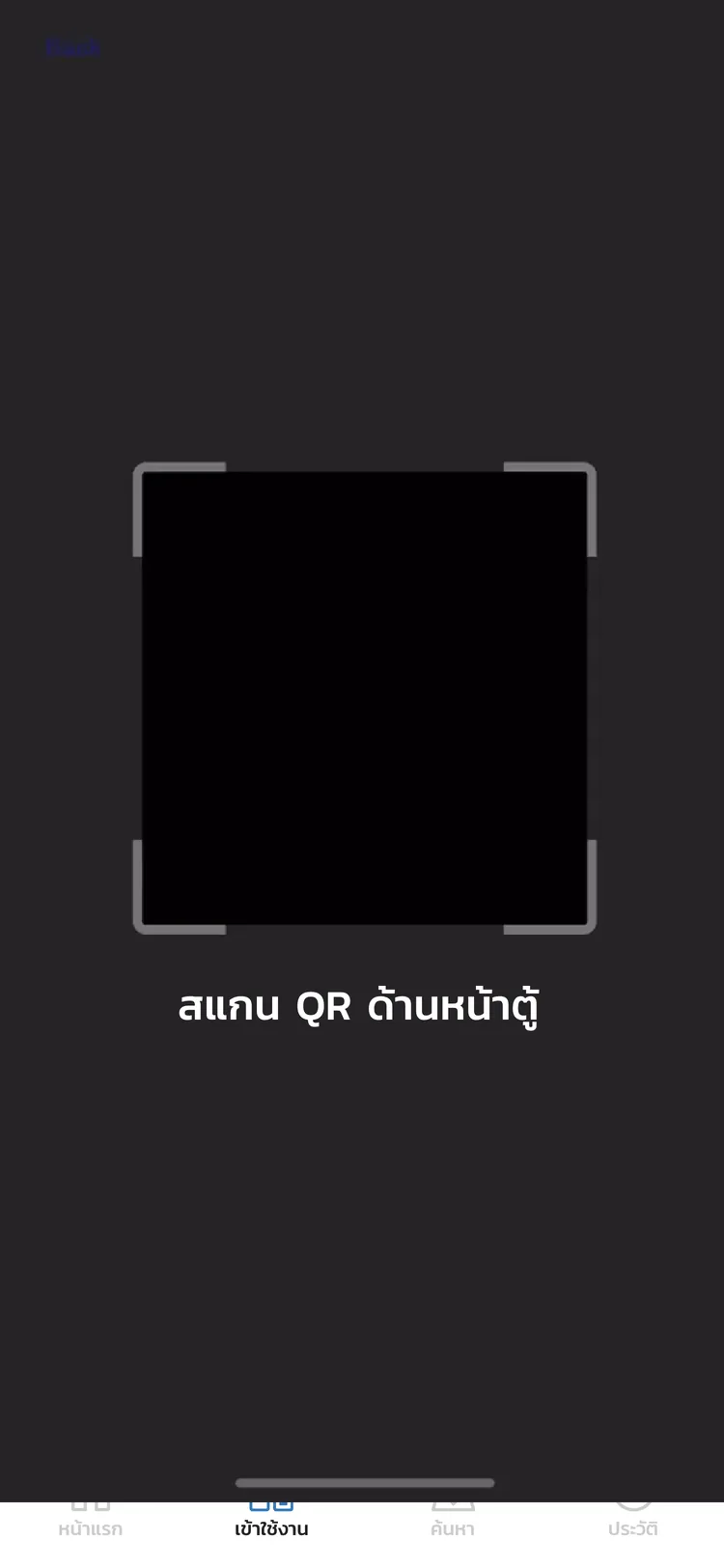
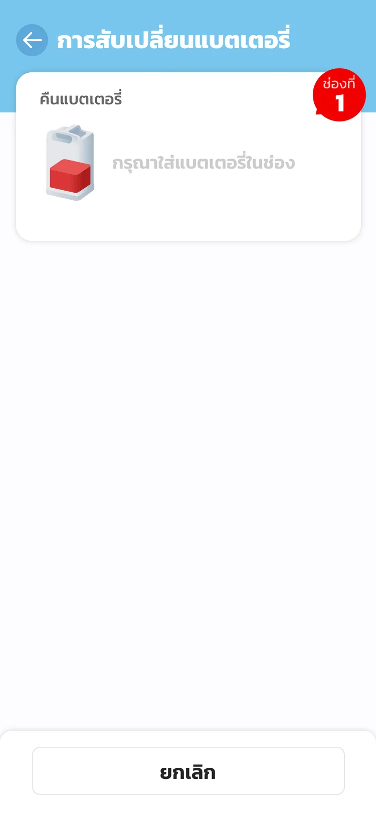
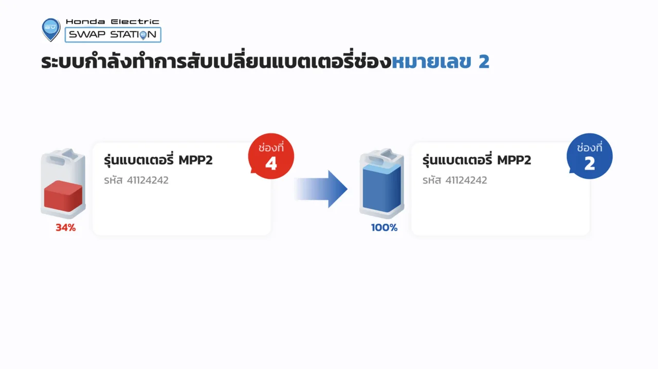
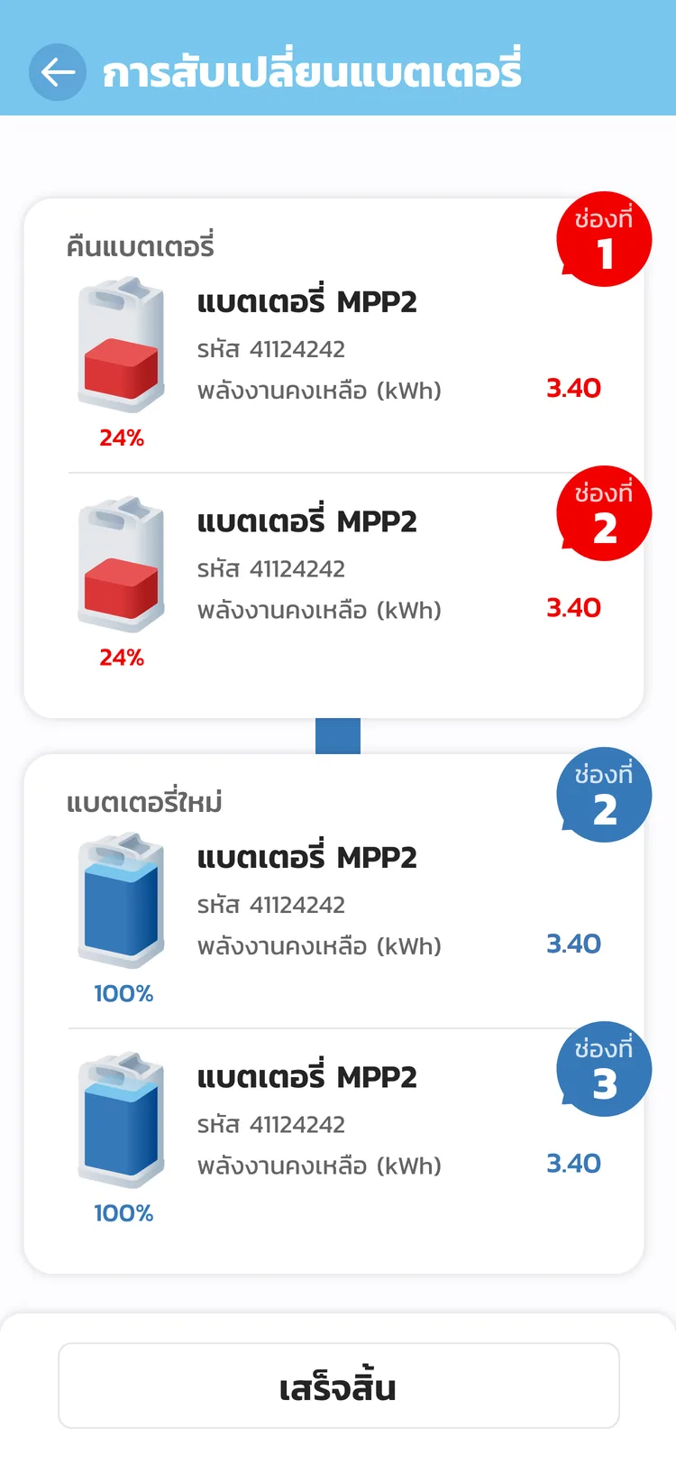
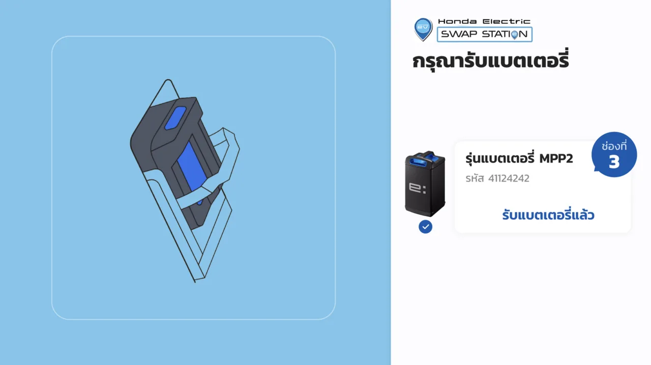
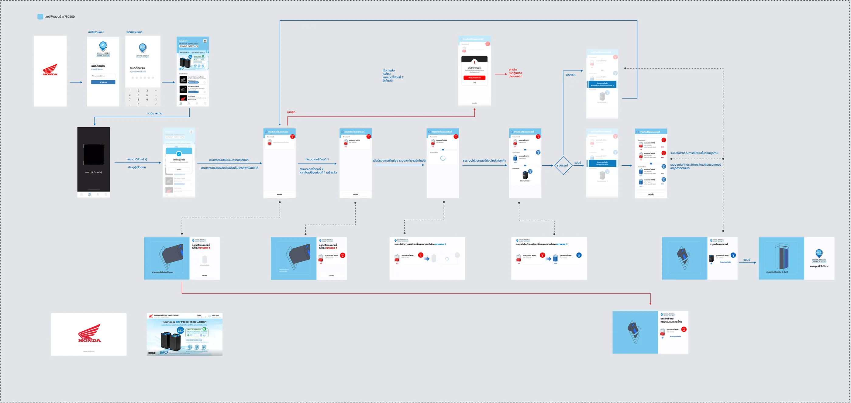
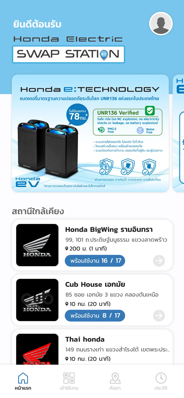
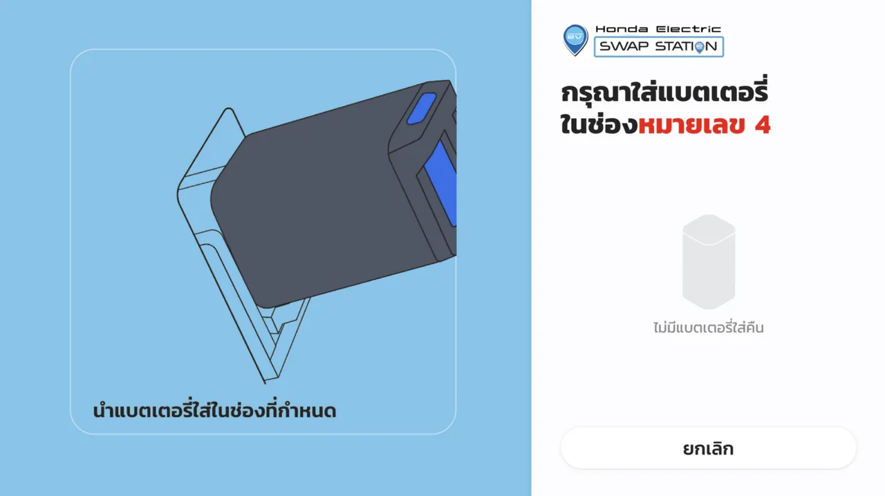
Scan a QR at the cabinet and the two screens lock together: the app hands off to the cabinet's touchscreen, which guides the swap slot by slot in oversized Thai readable at arm's length — return in slot 4, take from slot 2 — while the app waits, then records the session and bills the energy automatically. Eyes stay on the hardware, not the handset, and the unhappy paths (wrong slot, cancel, timeout) resolve without a support call.
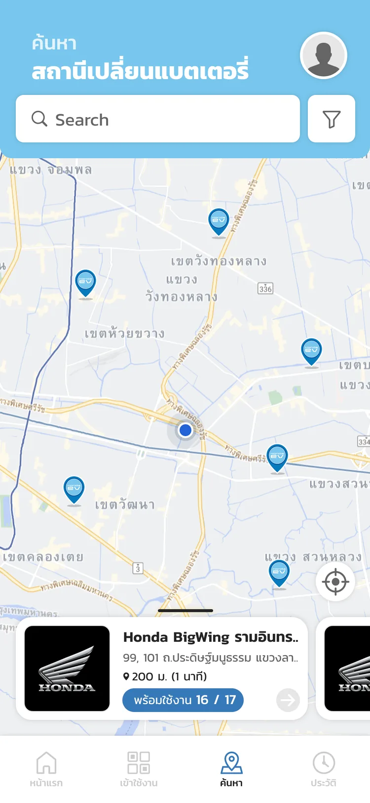
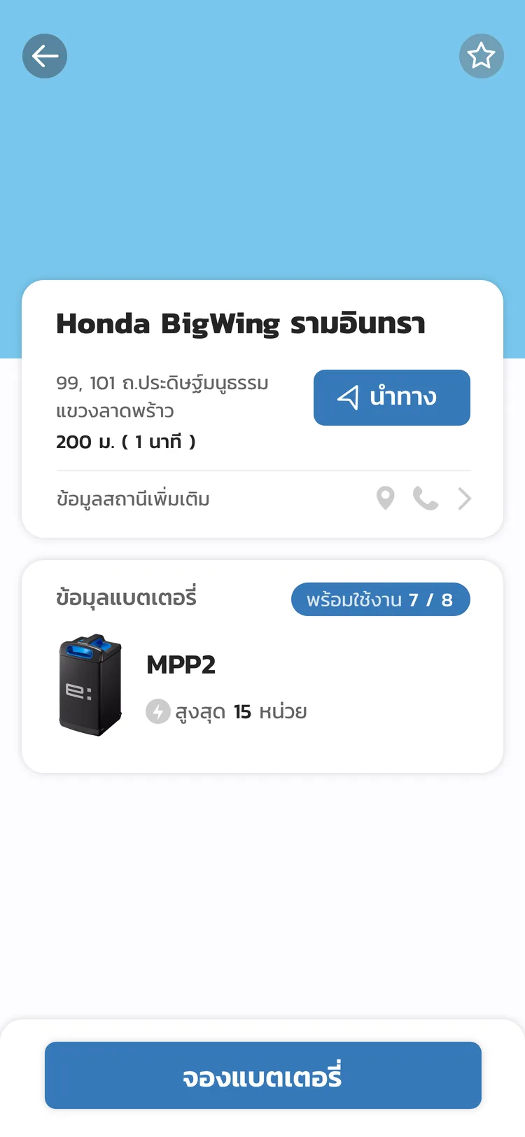
the handoff
Two screens, one state machine.
Hands are full the moment the battery comes out — so every decision moves in front of that moment. Watch it hand off, beat by beat.
beat 01 — scan
The phone finishes before the heavy lifting starts.

beat 02 — swap
The instant the door opens: you can pocket your phone.
beat 03 — done
One state machine — app and cabinet can never disagree.
ch.05 · approach
Across the whole platform
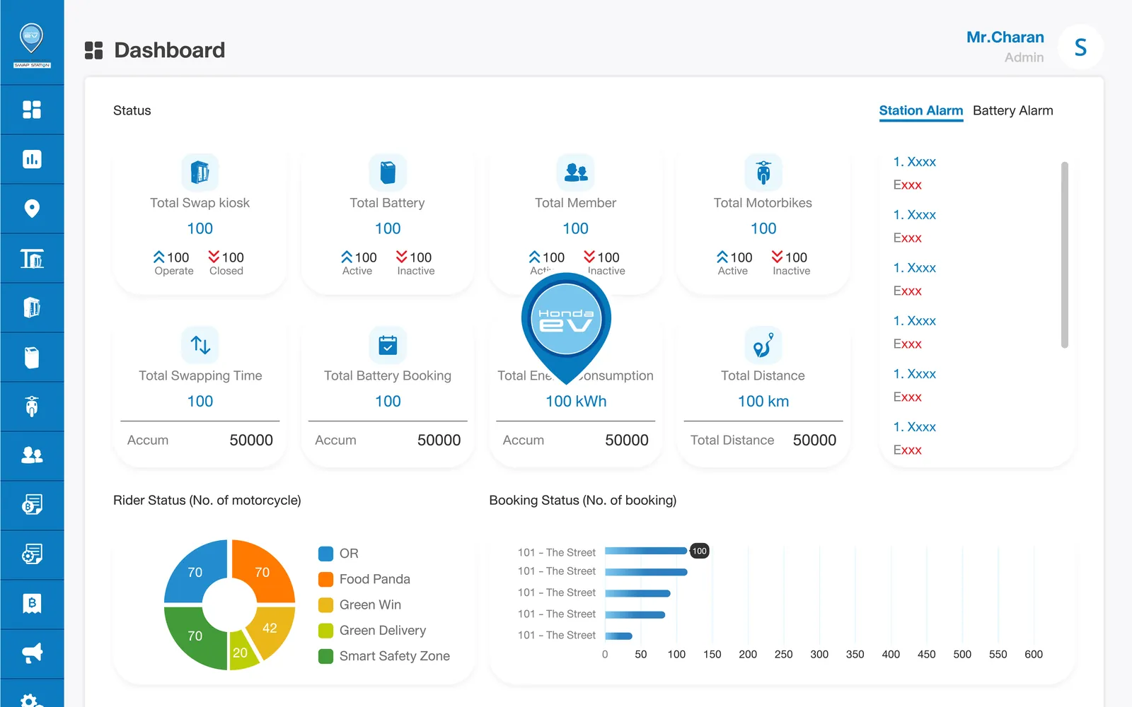
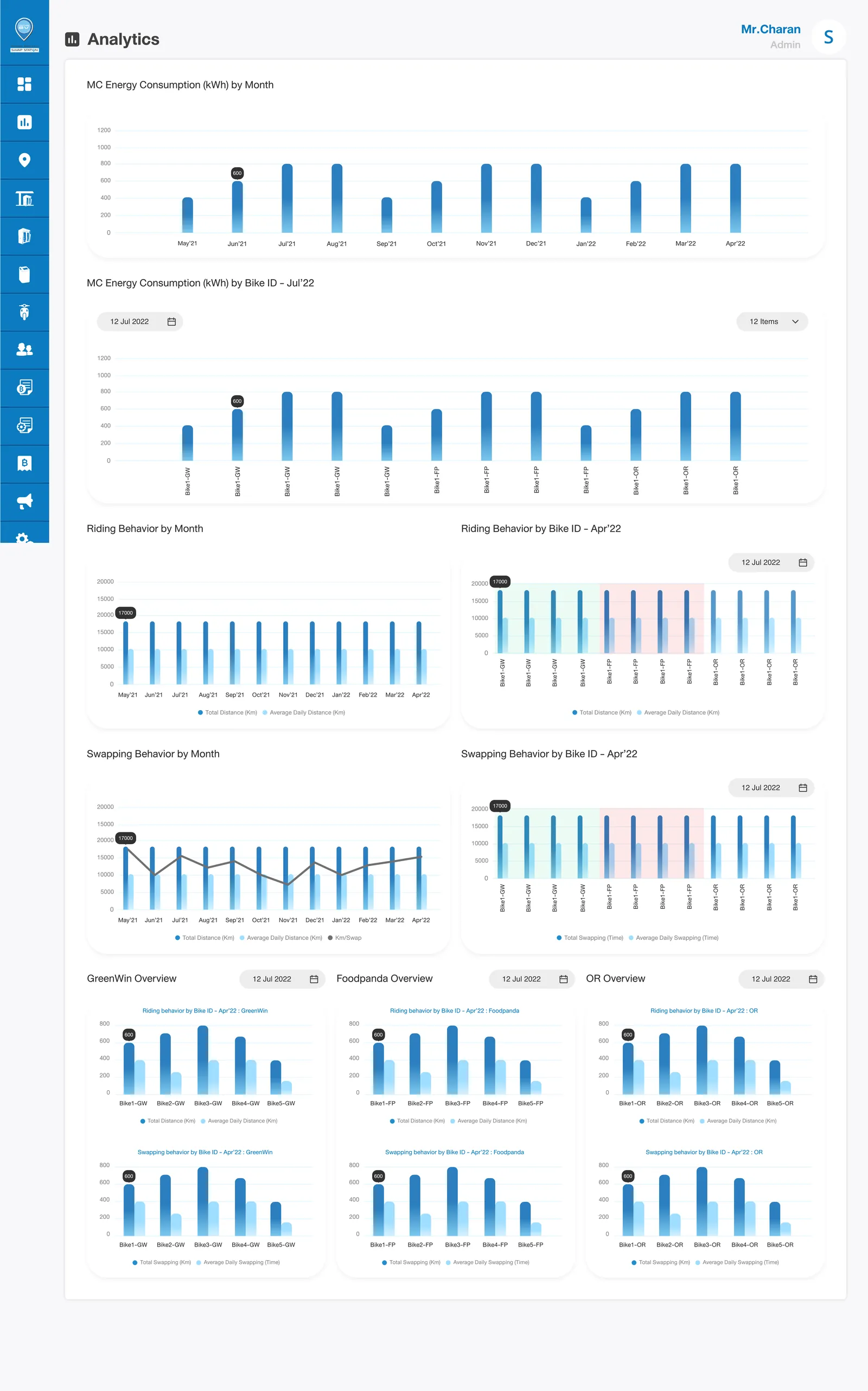
The app is the rider's surface, but the system runs on four: the cabinet firmware, the public website (scan · swap · start — Honda e:TECHNOLOGY, ~78 km range, around 75% cheaper than petrol), and an operator back office for stations, batteries, motorbikes, members and transactions. I designed every on-screen surface and acted as product owner inside the GridWhiz build, alongside Honda Trading Thailand and a battery partner.
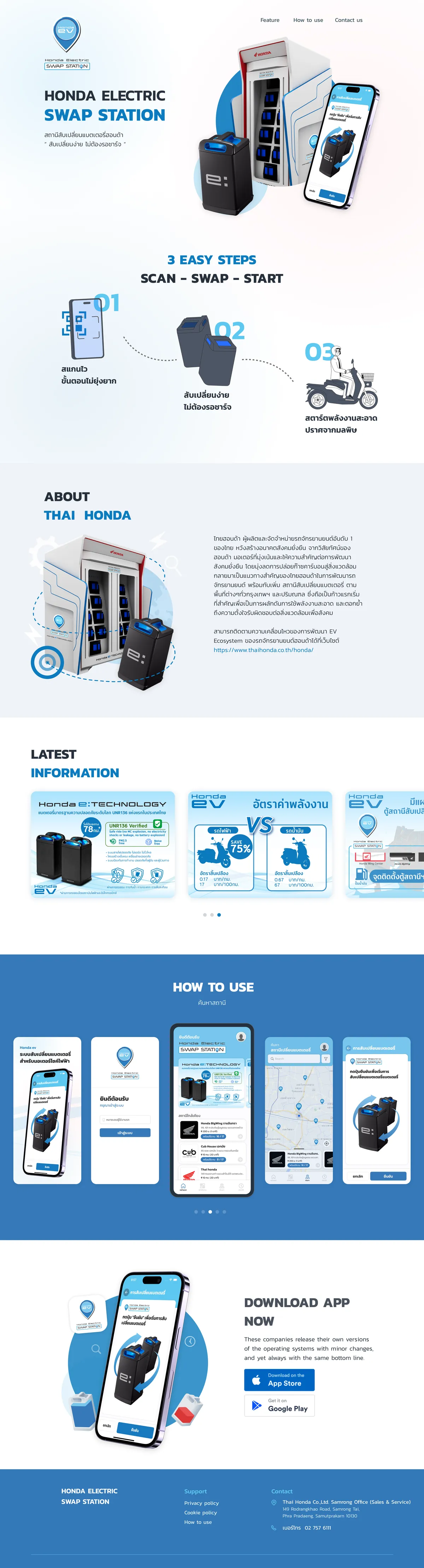
the reel · every screen, in order
ch.06 · outcome
Where it landed
In service across Bangkok
Thai Honda's electric-motorbike swap cabinets — live since 2023 and still in service, launched with press coverage
Four surfaces, one platform
app, cabinet firmware, public website, and operator back office shipped together in the GridWhiz × Honda Trading Thailand build
ch.07 · delivered
- Swap flow re-sequenced to finish on the phone before the battery is lifted
- App ⇄ cabinet firmware kept in one synchronised state — eyes on the hardware
- Public website and operator back office designed alongside the app
- Product ownership and coordination across the GridWhiz × Honda Trading Thailand build
ch.08 · reflection
If I did it again
Measure the design's own effect
Set a before/after benchmark myself — time-to-complete, error rate — instead of relying on Honda's field read.
Run usability testing with real structure
The field iteration worked, but a scoped usability test protocol would have caught more before installation, not after.
The real leverage was timing, not polish
The win wasn't a prettier UI — it was where the handoff between screens happens. That's the lesson worth repeating on the next hardware-paired flow.
accepted limitationMost of what's left to improve is on the hardware side — outside what a screen can fix.

next case