 Brand Guidelines · v1.0.0← Back to product
Krasa Brand Guidelines
The thinking, identity, and design system behind Krasa — from the first problem we found to the app people actually use.
Krasa is the bird thatalways flies as a flock
The stork is a symbol of long-distance migration, and it never travels alone — much like a good trip, which only works when the whole gang goes together. That's why Krasa plays the role of the buddy who helps plan things, not the guide barking orders, but the friend who's there with you the whole way.
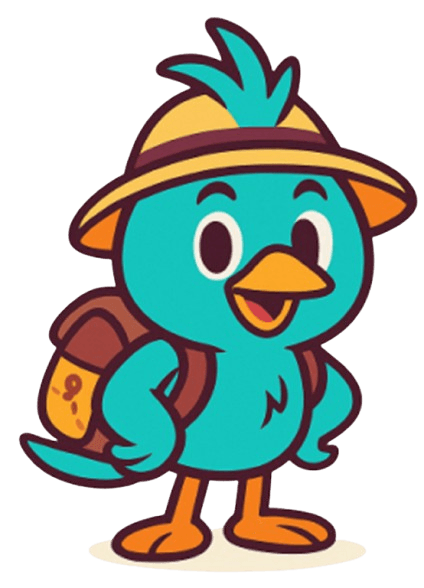
From group-chat drama to a single brand
Starting with the problem
A single trip meant juggling Notes, Sheets, Maps, and several money-transfer apps. Information was scattered everywhere, and it almost always ended in money drama.
Finding the insight
Every group has one trip captain who carries the whole load. Solve the problem for that person, and the other 3 to 6 friends follow naturally.
Staking out a position
Krasa isn't an OTA. It's the social and planning layer of travel that connects a group of friends to a real trip.
Setting the design principles
Simple, transparent, genuinely useful, and fun. Every feature has to clear this bar before it ships.

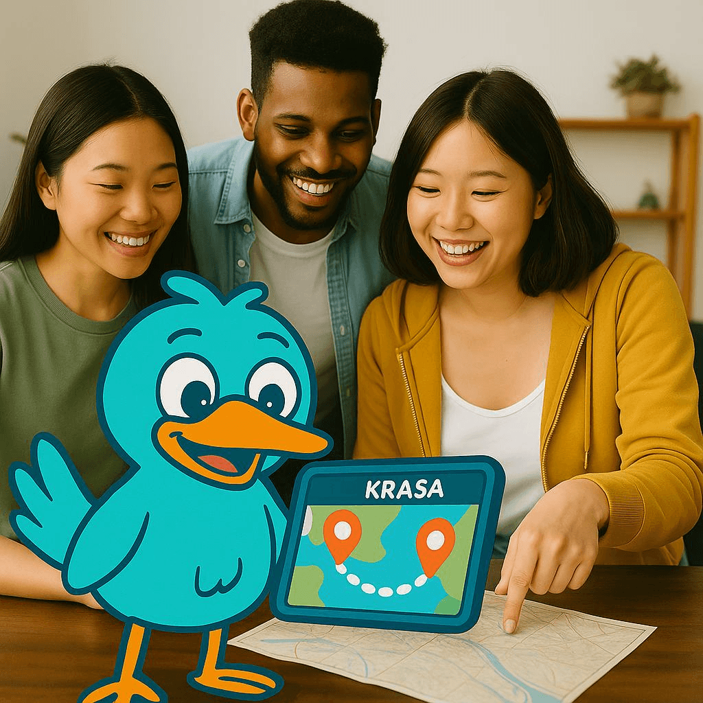
The gap Krasa flies into
OTAs focus on booking, Splitwise focuses on splitting bills, Wanderlog focuses on planning — but nobody has brought it all together for one gang to use at once.
The market gap: a Social + Cost-sharing Trip Planner nobody owns yet.
The k that hasa stork hidden inside
The stork's head sits inside the negative space of the letter k, making the logo both a letterform and a character in a single mark.
 On light backgroundsOn brand-color backgrounds
Clearspace around the logo
Leave at least 1x of clearspace on every side, for both the icon (7x proportion) and the full logo (16x proportion).

Minimum acceptable size
The icon should never print smaller than 3cm, and the full logo no smaller than 10cm, so the stork's head inside the k stays clearly visible.
app iconlistfaviconBright andtrustworthy
The teal of the sea and the stork, set against clean white. Every value comes straight from the real variables in the Figma file — tap any swatch to copy it.
60 - 30 - 10 color ratio
LINE Seed Sans TH
Easy to read, round and friendly, and covers both Thai and English in one type family — matching the brand's modern-but-friendly character perfectly.
Headlines & primary buttons
Subheadings & emphasized copy
General body copy
A buddy, not a guide
Krasa shows up at just the right moments — prompting votes, nudging about money, and celebrating when the trip wraps up — with a clearly designed personality.
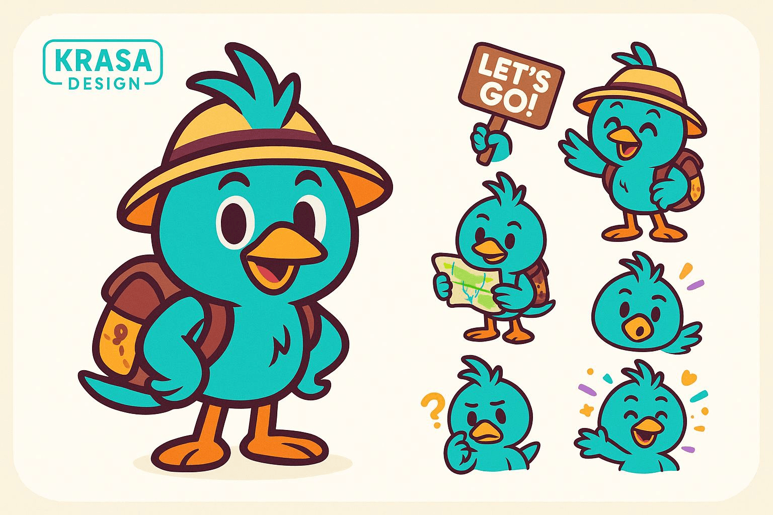
Talks like a friend who'sgreat at planning trips
Friendly & Collaborative
Like a friend who helps plan the trip, not a boss barking orders.
Smart but Simple
Smart about managing the plan, but simple to use — never complicated.
Adventurous & Social
Encourages people to go out and share the experience, instead of keeping it to themselves.
Stress-free & Transparent
Cuts plan-and-money drama down to zero.
Real voice from inside the app
 Hey, it's Krasa — I really wanna take you somewhere, let's gooo!!Let every journey begin right here.Where should Krasa take you next?
- ✓Concise, clear, and easy to understand — no jargon.
- ✓Warm and approachable, like talking to a friend.
- ✓Focuses on the fun of traveling, not the hassle.
Real components you can click around
Components from the same system used in the app, built from all the tokens above.
Buttons & inputs
Group-type chips
From the real trip-creation screen — try tapping one.
Radius & spacing tokens
Trip card
Rebuilt from the home-screen spec, crisp at every resolution.
This same system, on real screens
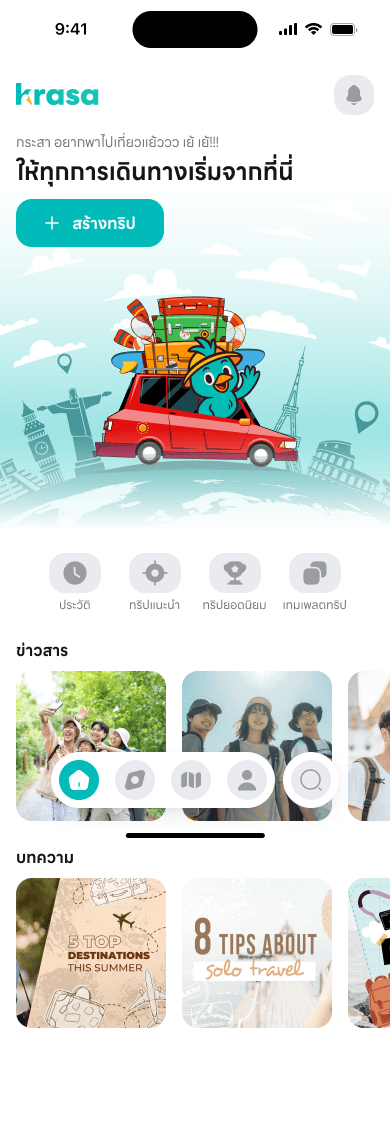
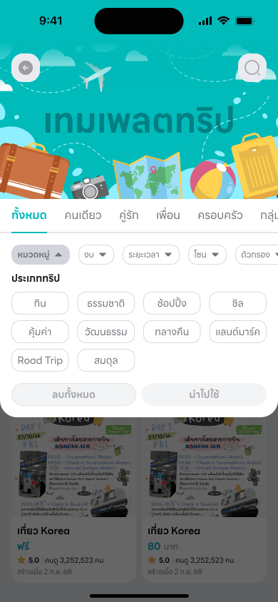
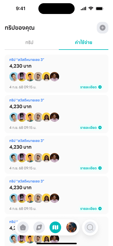
The brand is ready — let's see it in action.
This whole system is actually in use across the product page and the Krasa app.
Go to the krasa product page →